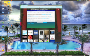
[caption id="attachment_4900" align="aligncenter" width="300" caption="example of rounded corners and css gradients"] [/caption]
Yesterday I came across two simple techniques while working on mapme.heroku.com, an app that will help me ramp up quickly on displaying maps and getting location from just about any browser. The first is gradients defined as image backgrounds. Here's an example of code:
 background-image:
        -moz-linear-gradient(top,#00BFFF,#ffffff,#00ff00);
The code splits the div it inhabits into 3 smooth color gradients for browsers which define mozilla linear gradients. To do the same thing for webkit based browsers:
    background-image:
        -webkit-gradient(linear,
         left top,
         left bottom,
         color-stop(0.25, #00BFFF),
         color-stop(0.49, rgb(255,255,255)),
         color-stop(1.0, #00ff00));
Colors can be added or removed in either definition, and if you want to support both mozilla and webkit browsers you can add both to the same style block:
#welcometext {
    background-image:
        -moz-linear-gradient(top,#00BFFF,#ffffff,#00ff00);
    background-image:
        -webkit-gradient(linear,
         left top,
         left bottom,
         color-stop(0.25, #00BFFF),
         color-stop(0.49, rgb(255,255,255)),
         color-stop(1.0, #00ff00));
}
The second trick I came across was rounded corners for divs. Webkit defines this with border-radius and mozilla defines this as -moz-border-radius. Again to handle curved divs for multiple browser types simple define both:
#welcometext {
    -moz-border-radius: 15px;
    border-radius: 15px;
}
You can see examples of both of these effects at the sinatra based image browser knowsinatra and it's rails cousin imagebrowser.