A different kind of resume
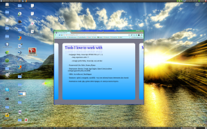
I spent time this weekend taking an ancient resume in an aging doc format and making it into something which better represents my current interests and pursuits. I received some excellent feedback on design tips and signaling issues not long after I posted my current resume and the supporting source on github.
Signaling Efficacy and Target Audience
I'll first address any signaling confusion brought up in reaction to posting the resume. Make no mistake, I want nothing more professionally than to breathe life into a new business, as it feeds into building a job I love. Many investors may want to know more about my background after a pitch, and this html5 "slide deck" fills that need. Besides having a URL as a business card feels more appropriate to the professional and cultural group I wish to work with.
In addition I'm certainly not above taking other gigs to survive while working on Victus Media's latest project. It doesn't benefit myself or the business to be in a position of desperation while negotiating with investors. They don't care how needy I am. Product and pitch are all that matters. I've been reminded time and again that when our product is ready and the market is proven, investors will seek us out.
Design suggestions from friends
There's an issue where one page is long enough to require a scroll button, which also grabs the mouse wheel up/down events. I spent time reorganizing and shuffling information, and debated disconnecting the mouse wheel from page navigation but settled on the current version. Using mousewheel down to read on, is a habit I couldn't ignore.
If you see the resume load, you'll notice the bullets slowly appear over a few seconds. That's something most HR folks or Job Placement teams will loathe and lead to them skipping over the document. That flow is completely intentional. As I mentioned earlier, this document is designed for a specific professional and cultural group. If your job is to read hundreds of resumes a day, you're not the audience I want reading it. The mantra of CouchDB sits very well with the theme of this fade in design, relax.
Being calm and focused is far more conducive to productivity, than being frantic and buried in busy work.
