How to understand visitors through data visualization
http://www.youtube.com/watch?v=DqJvld2fci0
A few times a year I dig into the data behind my blog page views and Google Analytics provides plenty of information to sift through. The key features I look at are engagement or time on page and raw page views or how many people visit a page. What I found intriguing about the above plot versus time was what it revealed about specific posts. A few posts attained high engagement and relatively significant page views over a long period of time driven primarily by search. The spikes in page views combined with time on page were driven by social referrals which I've captured in embedded images and text files below. I invite fellow data miners to compare your findings and discuss what you've learned about visitor patterns. Here's the mp4 if you have any problems viewing the above video Average Time on Page vs Pageviews
Sharing Analytics, What's most valuable?
The following are a set of images which capture a year of analytics for my blog. Please click through any images you are interested in reading to get a clear look at the metric data. I've also included csv files with the specific information if you'd like to play with it.
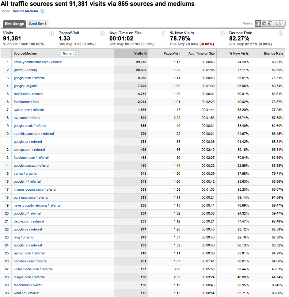
The first image represents the traffic sources to my blog throughout the year. Dominating referrals is news.ycombinator.com or Hacker News, direct visitors (bookmarks, typing in the url,l some twitter visits) was number two and search from Google was third. These were followed by reddit, feedburner, more twitter, and Fred Wilson's blog avc.com.

The traffic sources csv data file.
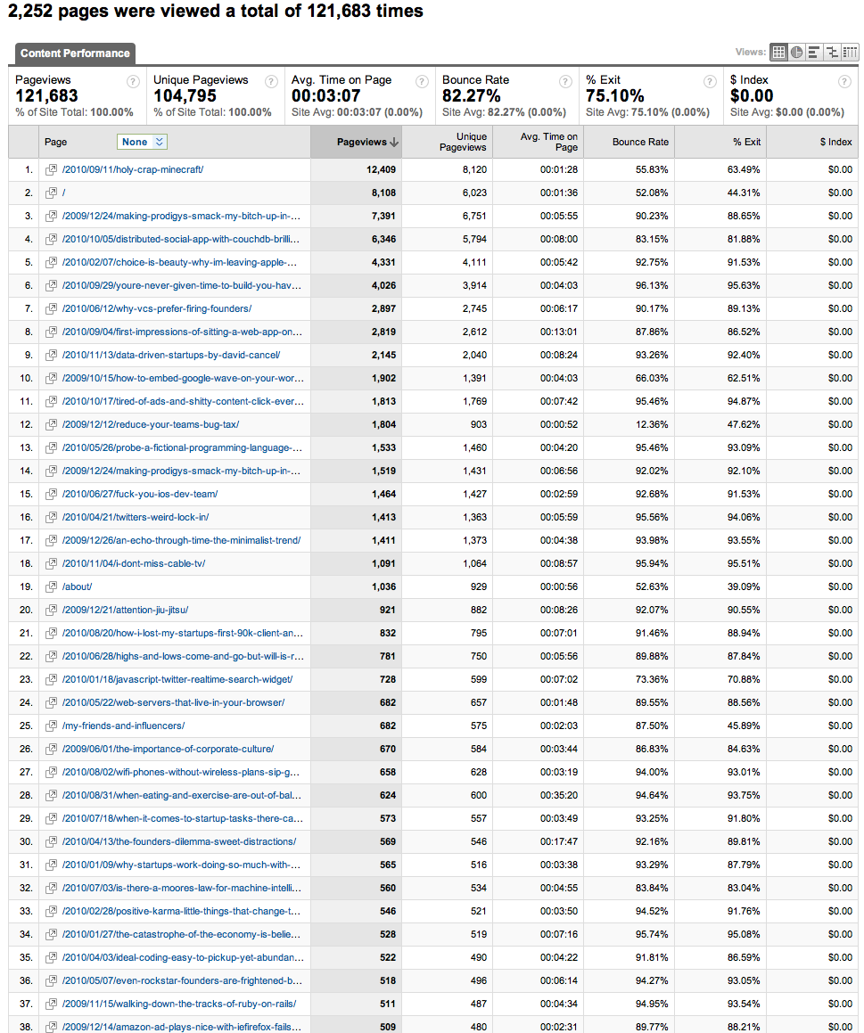
Post views breaks down the visits by post or url. The clear winner this past year is holy crap minecraft!.

The views by url csv data file.