Deep down the community I can most relate to needs a little adventure or wonder in the applications they depend on. One more block of dry predictable text, or another pointless pie chart is the kiss of death for my peers. Tabs, tables, slides, and spreadsheets are the tired manacles of a unidirectional presentation generation. We recognize that data is only truly brought to life in a read write form. Yet so much of what we rely on is mired in old design thinking. How do we break the chains?
Shake it up baby.
http://www.youtube.com/watch?v=tgd46QiHz4I
The strategy starts with delivering something which looks familiar, yet bubbles with creative inspiration and unpredictable chaos under the surface. Yesterday's tools aren't designed to remedy today's or tomorrow's data and visualization problems. Consider the most popular data manipulation tool in businesses today, the spreadsheet (I'll save its creepy uncle, presentation slides, for another post).
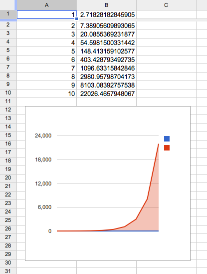
Spreadsheets are tried and true, column based, graphical user interfaces which run scripts on strictly structured data. Most spreadsheets have a ton of buttons and premade templates. Managers love spreadsheets for task planning, tracking man hours, updating current values, and most importantly charts. The output product of charts serves three purposes, rapid communication to aid decision making, encourage intelligent feedback, and show proof of productivity.
Trim the fat
The design decision is a no brainer for the results focused crowd, remove the latter requirement and focus solely on the former two. If the presentation doesn't deliver on rapid communication or raise necessary debate then there is no productivity.
In order to suggest an alternative to a common standard, we must examine how spreadsheets are structured. On the surface row column data makes up the standard sheet. Chart layers tie directly to the data and provide visualization. Under the hood the database format for spreadsheets is straightforward. It's a two dimensional cell array. Cells can be text, numbers or equations. That's it. This restriction has proven useful for many applications but it's time we extend the cell to the document, and replace the row-col database with a more robust alternative (rdbms, nosql). On the fly data modifications can be made by multiple team members while data is dynamically updated. The visualization layers can borrow from and mimic the rich variety of web interfaces available, including sorted image slices, animations, and more recently webGL applications.
Gorilla in a Prom Dress
We aren't going to convince a mass market to throw away ingrained standards (PowerPoint blues) overnight. What this community needs is a Gorilla, but what they expect is a hot prom date. The solution is to improvise. Slap a little lipstick and a pretty pink dress on an 800lb monster that's ready to tear through tasks like a hot knife through butter*.
Notes:
*= Examples of Gorillas in Prom Dresses:
- One prominent example is the Disqus comment engine. They have many millions (billions?) of comments chock full of expressed sentiment in a centrally organized database. The prom dress is a pleasing comment section for blogs and news sites with easy authorization (log in once, minimize spammers) and fluid conversations.
- Another example that comes to mind is node.js. The low level c libraries (Gorilla) are connected to a presentation layer of JavaScript and pretty frameworks (prom dress).
